
Color Study
On Pantone's Color of the Year, Eula Biss, white normativity, and more.

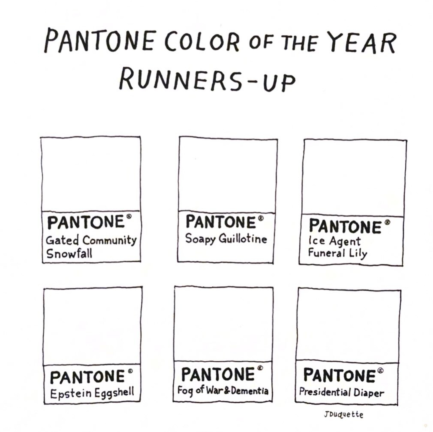
On December 4, Pantone announced its official choice for 2026 Color of the Year (COTY): Cloud Dancer White.
This choice has created a storm of reactions in my corner of the internet, a rush of refutations and responses ranging from incredulous to entirely nonplussed. The opportunity to learn from the Discourse™ is one of the greatest things the internet offers us in this day and age, and it propelled me to write this essay.
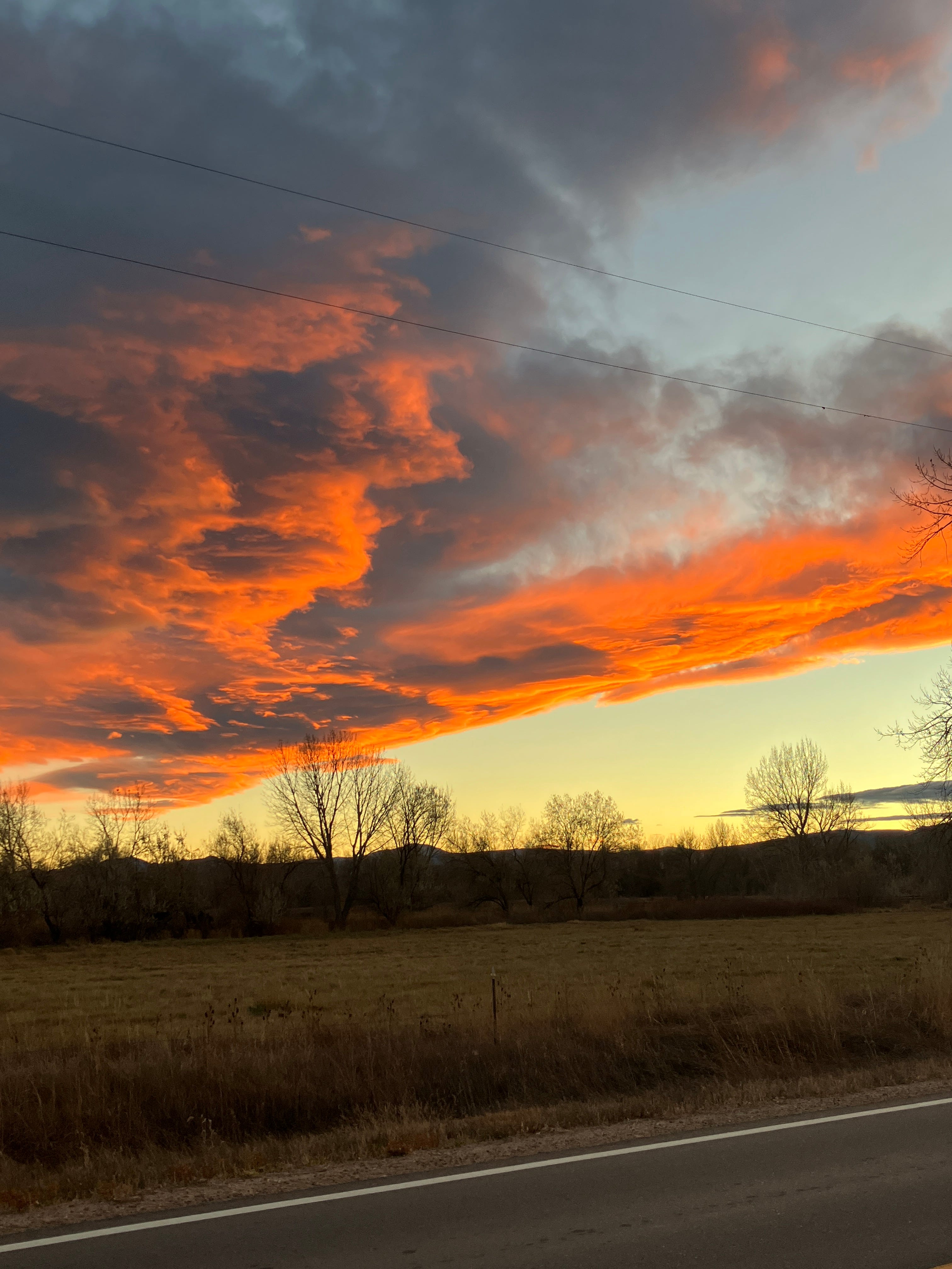
In addition to being a writer and cultural critic, I’m a visual artist, and all the visual work I do is shaped by color. If one of the most standard rules of strong, evocative writing is to “write with the senses” (and it is—I’m writing this now in the butter-toned evening light of the craft lab, cool air on my calves and thighs, the distant strains of classical Christmas music playing from the speaker upstairs, a residual from this morning that we never bothered to turn off; a Bordeaux blanc on my palate, my ears alert to the occasional bumps of Keana the cat rumpus-ing around in the bedroom), the corollary for visual art is color. Color is what illuminates our world.
~ ~ ~
After I saw the official announcement for the Pantone Color of the Year, I started to see the memes.
The memes brought to mind an essay by Eula Biss from her book, Having and Being Had (Riverhead: 2021). “The Right White” comes just after Biss and her husband, John, have purchased their first home—a position of privilege and choice overload that my partner and I currently find ourselves in. But it’s not the similarity of situation that drives me to Biss’s work. In this essay, Biss is wondering what color to paint the rooms in her new house, and she wields the titles of paint colors and like dislocated lines of poetry.
Her text reminds me that it hasn’t been that long since another prominent design firm (paint company Benjamin Moore) chose a variety of White as Color of the Year.
“This,” Biss writes, “in the year a white man will be elected to the White House. The selection of white as the Color of the Year was “inevitable,” the creative director of Benjamin Moore explains. “The color white is transcendent, powerful, and polarizing—it is either taken for granted or obsessed over.””
There is, currently, a white man in the White House: a white man that many people identify as an orange man, his off-coloration more particular than the racial identity he holds, the community united by racialization that he prioritizes with his policy choices. There is a white man in the White House. Last month—two months ago? How time blurs, passes in a white fog—he sanctioned the demolition of a portion of the White House, allegedly our most sacred national building, in order to construct in its place an homage to excess, an outrageous ballroom gilded in plastic embellishments, a decorative style architecture critic Kate Wagner—known for her beloved McMansion Hell blog—has termed “Regional Car Dealership Rococo (RCDC)”.
~ ~ ~
I am obsessed with the way Biss writes about color, but she is still not my favorite color writer. That’s Jaydra Johnson, author of the breathtaking essay collection Low: Notes on Art on Trash (Fonograf Editions: 2024). Her essay, “Art Under Duress”, recounts a depressive episode and her attempts to infuse her dull and dark seasons with color.
Jaydra writes: “I am trying to say something about power and inspiration, about the ways color and survival and freedom interrelate. I am trying to say something about regaining control of one’s life.”
That essay introduced me to Werner’s Nomenclature of Color, an early twentieth-century index of colors found in nature and paired with descriptions of their tones and where they occur. Jaydra writes about all kinds of psychological ramifications of color—the studies that show Baker-Miller pink can ease the anxiety of a prisoner, comments from her brother (who was incarcerated) about the grayness of prison, the orange targets on the prison jumpsuits.
~ ~
Jaydra’s writing introduced me to Werner’s Nomenclature of Color, but Third Ward is where color gripped me like a life force.
I didn’t appreciate color until Houston: There, I learned to see everything as artwork. (Jaydra writes: “Art was everywhere. I called it garbage. . . . I never recognized any of this as art because nobody named it as such.”)
While I lived in Houston, I worked at a community-based arts organization called Project Row Houses where color was lifeblood. The hallway to the upstairs offices was primary-school blue, the walls upstairs dandelion-yellow. The shotgun houses in my neighborhood were like crayons in a box, uniform but expressive, standardized but discrete—until they were razed to make way for bland, stucco townhouses, the real estate version of storm troopers, a colonizing force in millennial greige.

~ ~ ~
I was introduced to the work of Mickalene Thomas, whose use of color took my breath away. I watched as exhibiting artists with the Design Studio for Social Intervention (DS4SI) painted an entire shotgun house traffic-cone orange. I spent my afternoons slapping dominoes in the two-story, and I watched while Rick Lowe painted and inked intuitive patterns of color underneath the domino outlines.
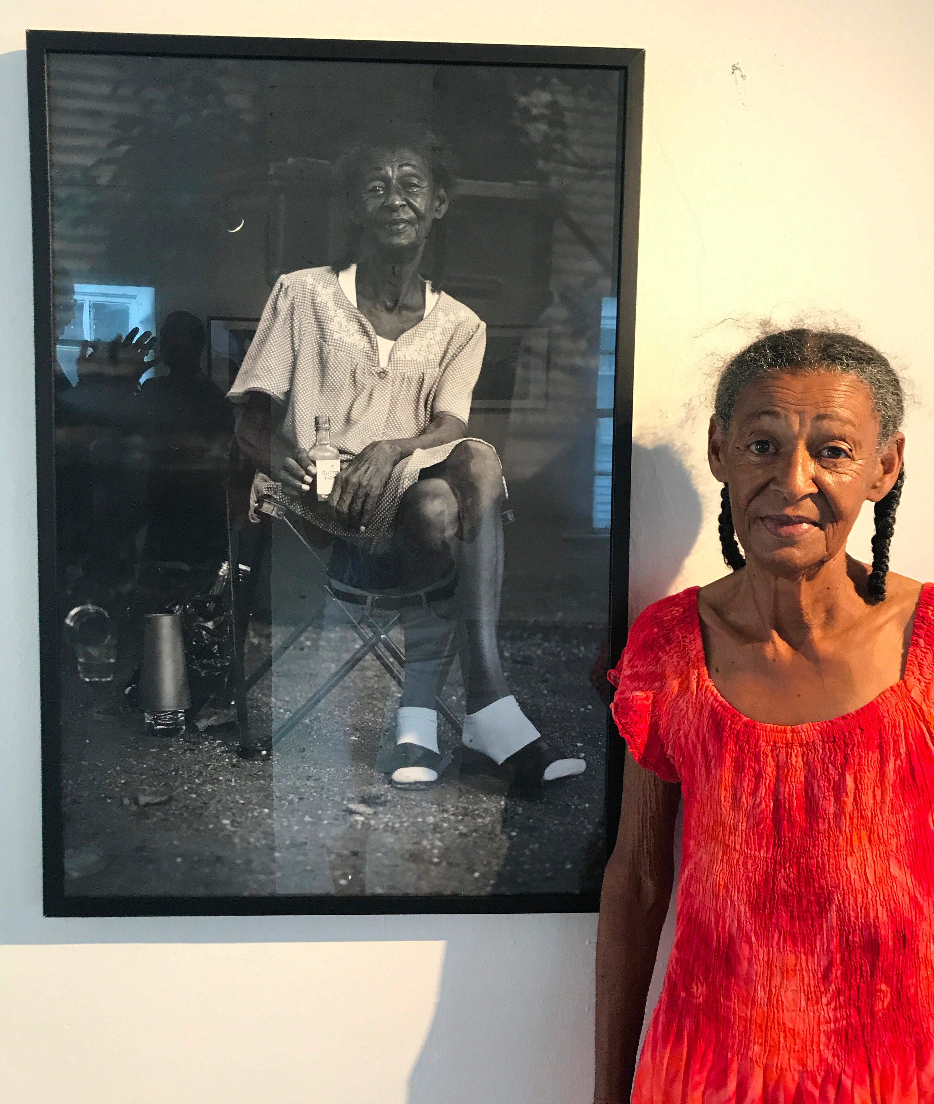
Of course, black and white were also present—inescapable—in the neighborhood. I stood witness while Colby Deal framed his shots, and later, when he developed his film in the solution baths, rich grayscale tones gaining definition, rising to print.
I learned color like everything else: as a neighbor first, a loiterer.
~ ~ ~
Pantone is an LLC based in New Jersey primarily known for its color standardization system. Thanks to the Pantone Matching System (PMS), creatives and designers the world over can trust that the colors they intend are the ones being used in their projects. Essentially, Pantone is responsible for making sure that the “robin’s egg blue” you think of is the same shade I meant—useful, in a global economy that would otherwise be ravaged by subjectivity, a kind of visual twist on he Telephone Game.
Pantone launched its Color of the Year campaign in 1999 as a way of galvanizing artists, designers, and—most importantly—consumers around a particular chosen shade. The inaugural Color of the Year, to mark the new millennium, was Cerulean. Since then, they’ve chosen at least one color every year (twice, they’ve chosen two).
Worth noting: Pantone has been the industry front-runner for establishing color consistency, but their field is for color printing. If you ask someone for colors on a screen, you’re likely to receive your answer in the form of a Hex code, a six-digit specification of a digital hue. These are two different color categorization systems, and therefore don’t have a one-to-one equivalence.
You can find a great digital history of the first twenty years of Pantone Colors of the Year right here.
My fave Pantone Color of the Year pick? 2004, Tiger Lily. Great shade. Did it influence my choices and emotions that year? Probably not. I was in fourth grade.
~ ~ ~
But back to the present, and its “Cloud Dancer White.”
House Beautiful, the design glossy, describes it as “one of the most understated - and intriguing - choices yet.”
Even Pantone’s pretense of universality—that by being the first profiteers to codify color, they own the language used to describe it—smacks of white supremacy to me.
One of the things that interests me in the COTY discourse is the language used to describe the color. This is maybe what Pantone does more than codify: it associates. Because for the human brain, meaning is made in concert, in the affiliative lighting of neurons, a firework of neural responses rather than a singular alarm flare. Via House Beautiful: “Pantone positions Cloud Dancer as a soothing antidote to a frenetic world.” Ah, yes. It’s not about the absolute; it’s about the position. Soothing: calm, polite, well-mannered, well-trained, will not make you uncomfortable over holiday dinners. A frenetic world. One where all these pesky non-White folks grasp for rights as if we haven’t consistently denied them for centuries.
HB: “Like a blank canvas [see: whiteness as normative], it symbolizes a collective desire [collective on whose part, exactly?] for a fresh start and new ways of thinking. This is a lofty white [oh—but aren’t they all?] that quiets the mind, encourages genuine rest, and gives room to breathe . . . ”
“I CAN’T BREATHE.”
Those words are not from House Beautiful but from Eric Garner, a Black man who was choked to death by NYPD in July 2014.
~ ~ ~ ~
In Having and Being Had, Eula Biss writes about Color(ed) Theory, a neighborhood-scale artwork by Amanda Williams in which Williams painted value-less houses in shades of products associated with Black consumers. About her work, which is featured in the National Museum of African American History and Culture, as well as other places, Williams has said:
“When you grow up in a segregated city like I have, like Chicago, you’re conditioned to believe that color and race can never be separate.”
~ ~ ~
House Beautiful informs me that “this year’s announcement reaches far beyond paint” and adds that Spotify even has “a curated playlist that captures the mood of the shade.” Believe me, I am so curious about what’s on it, but I stopped using Spotify due to their recruitment ads for ICE and other practices.
~ ~ ~
“Political implications aside,” states Jacob Gallagher in one NYT piece, “I do understand why a blank slate might be the right pick for this moment.” Right, but white people are the only ones who can get away with thinking that “white” is ever truly “blank.”
Gallagher, whether intentionally or not, is essentially expressing the concept of white normativity: the idea that “white is right;” white is basic, white is natural, neutral, all-encompassing.
White is not un-inflected. White is not neutral. White folks are not un-raced.
~ ~ ~
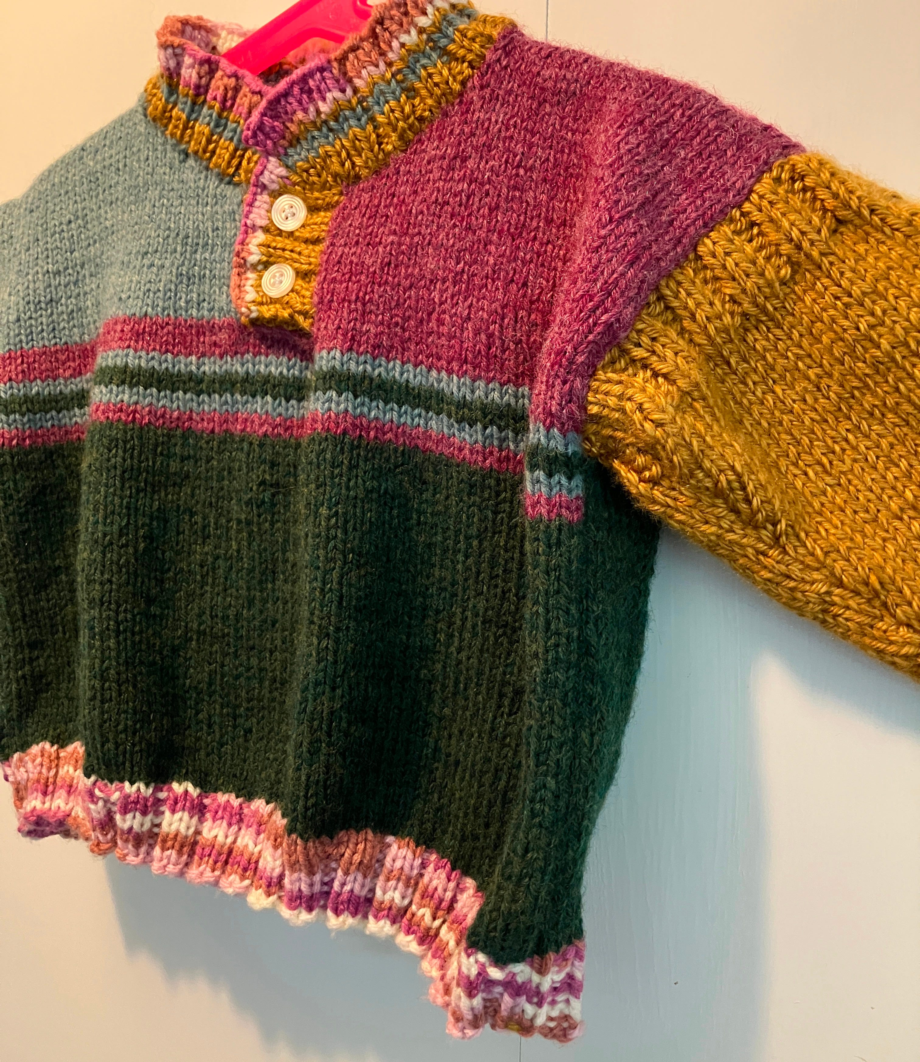
The instrumental classical Christmas that had been playing from my upstairs speaker has changed to “Pink Pony Club” by Chappell Roan and K-Pop Demon Hunters, and the sonic shift signals that Michael is on his way home. I’m left thinking about color as personal presentation, which, for many of us, reaches its most quotidian expression in the form of clothing. Today I wore a cream-and-green botanical patterned jumpsuit over a rich burgundy-purple long sleeve. It’s the same long sleeve I wore on Thanksgiving with an orange patterned sweater vest and Michael insisted that I was clashing. Turns out, I don’t care.
I recently noticed a little girl—maybe five or six—wearing sequined pants under a rainbow-heart-print dress, with leopard-print furry boots. Kids seem to dress like that all the time: their innate sense of style has yet to be ground out of them. And I’m sick of saying “I dress like a kindergartener” like it’s an apology and not a claim to fame.

I’d love to know what color studies you’ve noticed lately. Where do you tend to find color collisions that make you stop in your tracks? And can you identify the spaces that leave you starving for them?
A treat as always. But seriously, color is a rich road and your lush writing does it justice.
I have a book to recommend about the history of various colors: The Secret Lives of Color by Kassia St. Clair.